Delaney: So today we’re diving into three ways to consider accessibility in design.
Melanie: Hello, and welcome to our second Red Thread Brands Thread Talk. I am Melanie.
Melanie: I am joined by my lovely colleague, Delaney.
Delaney: Hi!

Misconceptions of accessible design
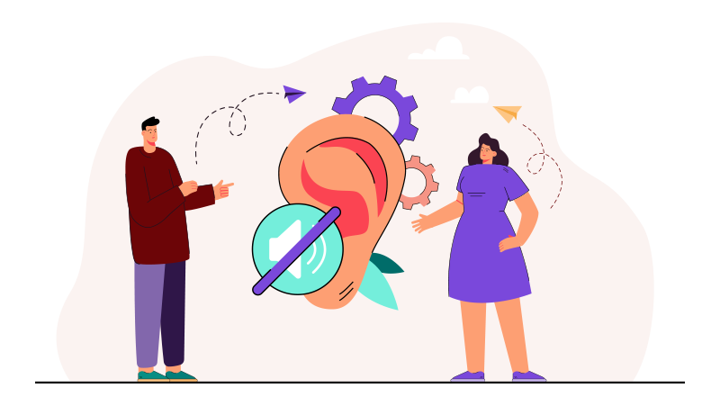
Delaney: And I do want to start right off the bat by bringing up one of the misconceptions about creating accessible design. We tend to think that it’s expensive or time-consuming, and that’s not necessarily true.
The issue is when accessibility isn’t considered from the beginning of a project. So if you bake in those processes to improve accessibility from the start, then there’s less effort spent updating in the future. The kicker is that everybody benefits. Accessibility is essential for some, and it’s useful for everyone.
Melanie: Okay, so what you just said seems really important. Can you say a little bit more about that?
Delaney: Yeah, so for instance, people on a train or in a library, they can watch the video with the captions on without sound because you’ve considered that and added captions. And then people with limited bandwidth, or maybe a slow internet connection, can read a transcript instead of watching a video. Someone who has a temporary loss of ability–for instance, a broken arm–can tab through a website instead of clicking and using a mouse.
Melanie: Okay, so speaking of something temporary, I can sort of relate to this. I did a study abroad program in Germany, and I remember it was always really helpful for me to watch TV or movies with the closed captioning on because German is not my native language. So being able to read the words while I was hearing the words was so helpful.
Delaney: Exactly. So we’ll talk today about assistive technologies, like what you’re talking about, which enables and promotes participation and inclusion. And again, this is helpful for all, for instance, in your situation Melanie, but also essential in three areas.
1. Designing for low vision accessibility
Delaney: So, the first one we’ll talk about is low vision.
Create sufficient color contrast
Delaney: When making considerations for low vision in your design, you’ll want to create sufficient color contrast. There are some really great tools online to test your contrast to make sure that it’s readable.
Speaking of color, you want to avoid relying on color alone to convey an idea. Using additional text or graphics to indicate your meaning is really important.
Support text resizing
Delaney: Support text resizing. If someone needs to zoom in really close on the text to see it, you want to make sure that the window doesn’t scroll both ways. You know, how you can scroll up and down. If you also have a horizontal scroll, the user can get really lost and lose their place which can be confusing. Also make sure that whenever you set up text in your window, it can support zooming, and that images and words don’t overlap.
Use descriptive anchor text on links
Delaney: And then another thing is using descriptive text for links.
Melanie: Okay. So like if somebody’s using a screen reader, you don’t want the link to just say read more. Because then if they’re listening to the links and the list is just ‘read more, read more, read more, read more…’
Delaney: Yes, so instead of ‘read more,’ maybe you use a more descriptive text so that you can really get to where they need to go with a screen reader.
Have a clear point of regard
Delaney: Another thing is to make sure the point of regard — the visible area in the window — is showing the proper content when it’s resized, the user zooms in, like we were talking about before.
The way that we’re designing for mobile these days and using responsive design is great for this because as the window is resized, the content kind of shifts and reorganizes itself, so it’s all visible.
Speaking of point of regard–when tooltips or a hover state pops up and it’s not in the point of regard, then it’s just completely lost and the viewer can’t see it. And I mean, you can imagine how frustrating or confusing that could be for someone if they just can’t see what they need to see. Then they probably will leave your website if that happens. So we want to make sure that whenever you hover over something that it’s going to be inside that point of regard.
Melanie: Yeah, and in marketing, we’re trying to keep them from leaving the website, right? We want them to stay.
Delaney: Definitely. Also if you have any interactive content such as a filtered search–for instance, if you’re looking for a flight and you have a filtered search on the left-hand side– make sure the actions are visible and are clear when you’re zoomed in. So if someone clicks on something, the result of that action is clear.
Support keyboard navigation
Delaney: And then lastly, for low vision, support keyboard navigation and have a clear focus state. So if you don’t have a clear focus state, then the person can again get lost on the page.
2. Accessibility for hearing impairment
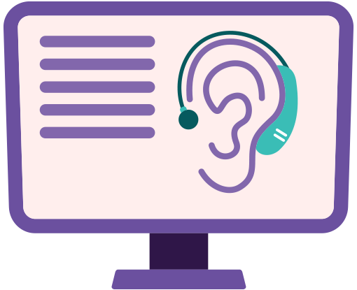
Delaney: All right. So second, we’re going to talk about some considerations for hearing and speech. We talked about closed captions earlier. Those are really important.
Also, transcripts. Whenever you have a text version of the speech and also the non-speech audio information in the video so that the viewer can understand the content.
Melanie: Got it. And as a bonus, that also helps with SEO.
Delaney: Yes, it does. Exactly. And the last point, if you have a voice-based service on your website, you want to make sure that there’s an alternative.
Melanie: That makes sense.
3. Considerations for cognitive accessibility
Delaney: Alright, lastly, we’re going to talk about some considerations for cognitive or learning.
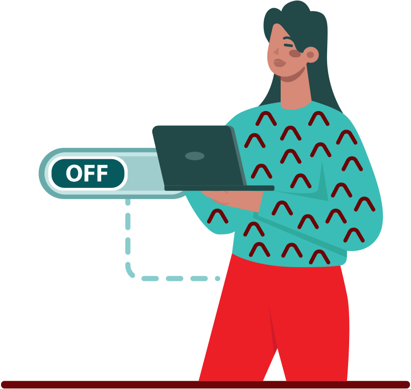
For instance, if you have animations on your website, or video, or a carousel–which hopefully you do–you want to give an option to turn the movement and sound on and off. People with a vision, cognition or learning disability can find that movement and sound very distracting and can’t digest the content because of it. Earlier, we talked about how responsive design is helpful when zooming in on content for low vision, so it’s also a helpful tool when someone needs to reduce the whole amount of content they’re looking at.

Create flexibility in your design
Delaney: There may be too many elements on the page and it can be overwhelming. By resizing that screen, the content is a lot easier to understand. And in general, creating flexibility in your design is really useful. For instance, if someone can change the color combinations through a style sheet, that’s great because they can combine the colors to what works best for them. It makes the content the most visible to that individual.
Melanie: That’s really cool. And not something I necessarily would have thought about.
Delaney: Yeah. I know. I love that there’s flexibility.
Melanie: And color is so important in design. So this is really an important point, I think.
Delaney: Exactly.
Create a clear content structure with proper coding
Delaney: Headings, lists, tables, input fields–make sure that all those are marked up properly and that the content structure is clear in terms of coding.
Melanie: Okay. So I’ve heard of Header 1, Header 2, Etc, but I thought that was just for visual design.
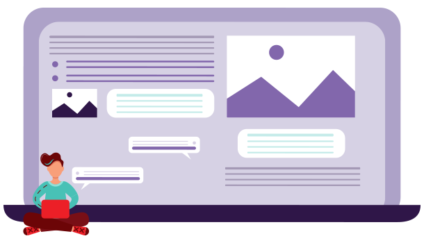
Delaney: Well, it is, but also in addition to visuals, it helps establish the way that the information needs to be organized and it can be easier to digest because of that.
Melanie: That makes sense, so like an outline.
Delaney: Exactly, just like an outline. So anyone using a screen reader can get to where they need to be really fast.
Melanie: Could you give an example of how that would work?
Delaney: Yeah, so for instance, if your website is about fruit–that would be Header 1. Header 2s would be apples, oranges and bananas. Then the user can select that they want to learn more about oranges. So they select Header 2: Oranges. And underneath that header, there will be Header 3s, so Mandarin, Tangerine, Clementine. So they can get right to that.
Melanie: I love how you can just come up with different kinds of oranges.
Delaney: Who doesn’t like fruit?
Melanie: That makes sense, though.
Provide clear instructions
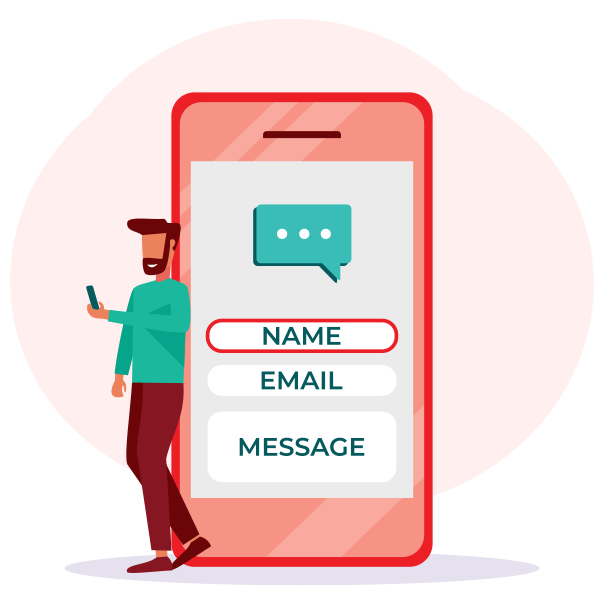
Delaney: All right. So next, we’ll talk about if you’re asking the viewer to enter any kind of information. Make sure that if they don’t enter it correctly, you’re giving them instructions and an error message.
Delaney: Helping them correct the issue so that they can be successful. You’re setting them up for success, basically.
Melanie: Okay. So I think these are all really great considerations. You talked about considerations for low vision, considerations for hearing and speech, considerations for cognitive or learning, and what would you suggest for someone who is just getting started with trying to make their website or their marketing materials more accessible?
Getting started with designing for accessibility
Delaney: To get started, you need to either appoint or become the person on your team to be the leader in accessibility. This is a person that the whole team looks to from the beginning of a project in order to audit and check for accessibility along the way. And it’s also for the entire team to understand the importance and why accessibility is essential, especially if you’re working cross-disciplinary. If you’re working with stakeholders, they all need to understand the basics of accessibility and the why – why are we doing this?
Melanie: Okay. So, if you’re that person, what would you suggest for learning information that you can share with your team?
Delaney: Well, a great place to start is where I got started: the W3C website: W3C.org. W3C is World Wide Web Consortium. They have presentations and workshop materials, resources you can pull from and you can use that material to educate your team. It’s also just a really great resource in general when researching accessibility.
Melanie: Oh, very cool. Can we put a link to those resources somewhere handy where people can get them?
Delaney: Oh, yeah. I got you. There’s a link already in the design section of the trend report where you can go straight to that w3c.org website.
Melanie: Well, fantastic. On that note, I would highly suggest that you download our full trend report on our website, redthreadbrands.com. It’s totally free and you’ll see these aha moments from Q2 design, but you’ll also see our aha moments from PPC, from SEO, from web development, from social media, and you can check all of that out and get more information. And of course, you can always contact us with questions, or if you’d like to work with us. You can follow and like us on Facebook and Instagram and stay up to date because we’re always posting quality content like this. As we are learning, we want to share that information.
Delaney: Keep in touch with us.
Melanie: Yes, absolutely. And thanks so much for watching our Thread Talk. Our next Thread Talk will be, I believe, about trends in social media. So stay tuned. Thanks Delaney.